Checkout Wows New Tailwind Design
Welcome to WOW blog’s new tailwind design. Wow has gone dark! After having the previous design for 2 years it was time for a change. One of the major reasons for the redesign was to reduce the loading time speed. Another reason is to increase health benefits, bizarre I know but read on. Amongst all these changes there have been plenty of changes under the hood too. Venture on to check out the trials and tribulations of the new design, if you dare!
On a whole, the design took 3 months to build in my spare time. Alongside my full-time job in education and studying. The new design aims to embrace Dark mode, which reduces energy usage in devices. Yet, the main reason behind going dark is the health benefits. The blue light emitted from screens can cause eye strain. Dark mode reduces the blue light, which causes symptoms such as insomnia and headaches.
As stated another reason to change was to increase the speed of loading the site. WordPress loads a lot of dynamic content. Thus it is difficult to reduce the speed compared to a static website. Here are 3 steps that I considered.
- Reduce scripts
- Remove Unused CSS
- Remove plugins
Reducing Scripts
In my previous theme, I used the Font Awesome icon library. Like many, I loaded the whole library to use a few icons. To reduce this usage I opted to use inline SVGs. The code adds a little weight to each page but it has also removed an HTTP request in loading font-awesome.
WordPress theme and plugin developers have made use of the jQuery library. I too have also have used jQuery for menu navigation and the projects page. I decided it was time to ditch jQuery in favour of modern vanilla JavaScript. As a result, I re-wrote several components of the page including the projects page
After a 6 month trial of using Google Adsense, I decided to remove ads. This wasn’t a difficult choice to make. A good majority of users block ads, including myself. Removing them speeds up the site more.
Reducing CSS
In my previous theme, I used the Bulma CSS framework. Frameworks are great, but they can also add a lot of bloat and unused styles, which increases the CSS file size. With this in mind, I switched from Bulma to Tailwind to design my new theme.
Don’t get me wrong I still love Bulma and will continue to use it for my projects. I wanted to increase my website sped so switching to Tailwind was a no-brainer for me.
Tailwind Design Speed Gains
Tailwind is a utility-based framework. As with Bulma, you add CSS classes to your HTML elements. With the help of Node and PostCSS, it produces a CSS file with only the styles you use. As a result, the new Tailwind design compiled a stylesheet 41.2 kb in size. Compare that to the previous Bulma stylesheet which was 208.7 kb. You don’t need me to point out the savings in size.
Removing Redundant Plugins
WordPress is great but having too many plugins can reduce the speed. Over the years I have removed several plugins. If I required a particular feature I created it or decided to go without. The main thing is to adhere to the WordPress coding conventions.
Other Changes
I have made a valiant effort to make my blog more accessible for assistive technology. This is something that I plan to research more and make further improvements in the future.
My last design used a custom NavWalker to build the main navigation. This was rewritten to incorporate the inline SVGs, mega menu and search feature.
Tests
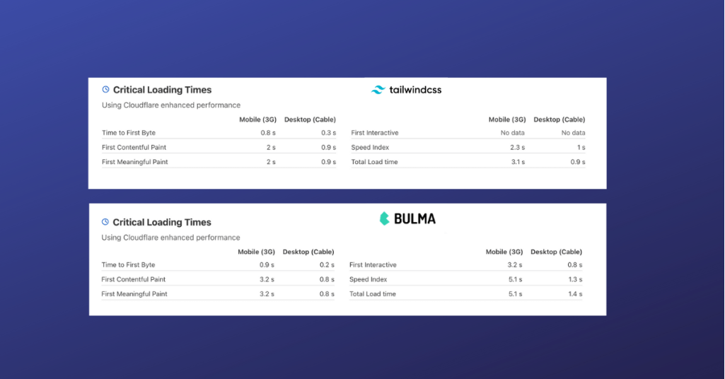
I ran the same test in CloudFlare before and after changing the theme, with Adsense running at the time. Here are the results.
 CloudFlare Comparison Between Bulma and Tailwind Design
Conclusion
WordPress is a good platform to work with, but it is more demanding on the server with every new release. This makes websites slower as a result. By switching to the new tailwind design my site speed has improved.
