Build an Awesome Daisy UI WordPress Theme - Part 2
Daisy UI is an awesome selection of Tailwind components for your next WordPress classic theme. You can have your custom theme up and running within a few weeks. In the first part of the series, we set up the environment to build an awesome Daisy UI WordPress theme. This part features building the basic layout, navigation and footer.
- Part 1 – Setting Up
- Part 2 – Adding Nav, Footer – You are here
- Part 3 – Mobile Friendly Navigation, Widgets
- Part 4 – Post navigation, comments and Post Meta
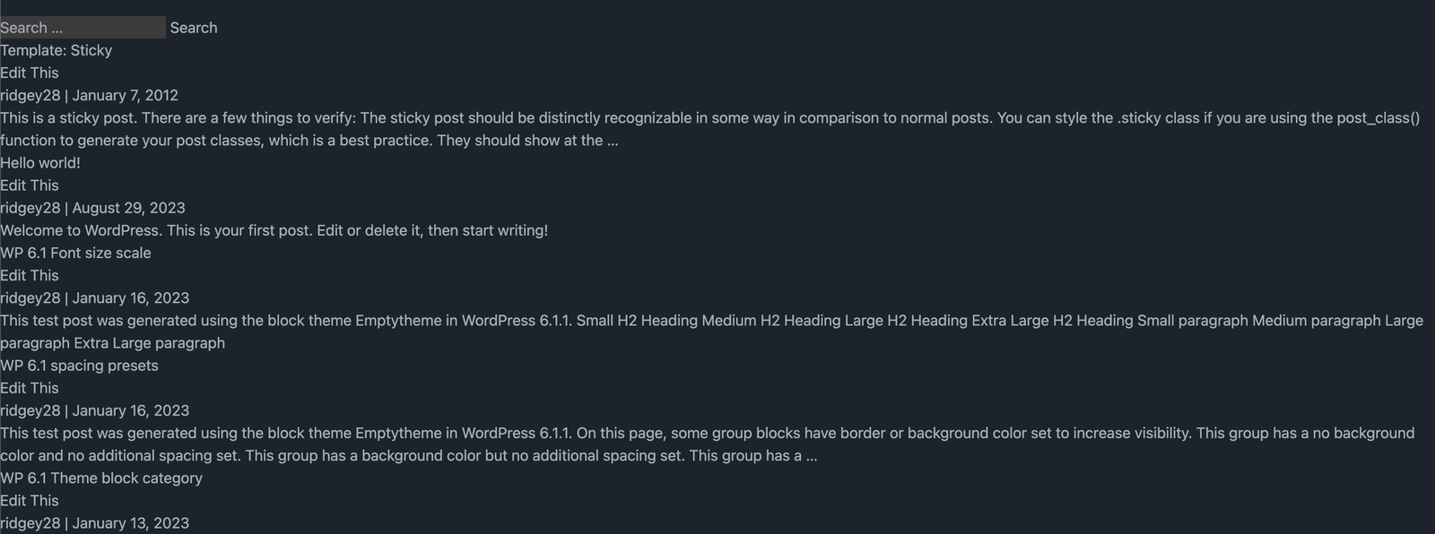
 The layout before making any changes.
Dependency Changes
Since the first part, there have been many changes to the infrastructure. Node has been updated, using NVM, to 20.10.0. If you have already set up your environment you can use npm-check-updates to update your dependencies otherwise clone part 2 of the repository on github. You can find part 1 here.
1npx npm-check-updates -u
Followed by:
1npm install
Layout Changes
The main change added is a margin around the content in the wrapper which starts in the header, below the navigation and ends above the footer in footer.php. I opted to use a simple footer which contains the basic information.
 Added a simple footer
Managing content inside the individual blog posts and pages can be time-consuming when creating your articles in the post editor. To address this problem there is a Tailwind plugin that automatically includes default styles and sizes for headings, paragraphs, tables and so forth. To install the Typography plugin run the following command in your projects terminal.
1npm install -D @tailwindcss/typography
There are many classes that you can use from the Typography library. We will simply add the prose class to the entry-contents.php file.
 1<div class="prose" itemprop="mainEntityOfPage">
 2....
 3</div>
Other changes made: The headings in entry.php have been made larger using Tailwind font sizes.

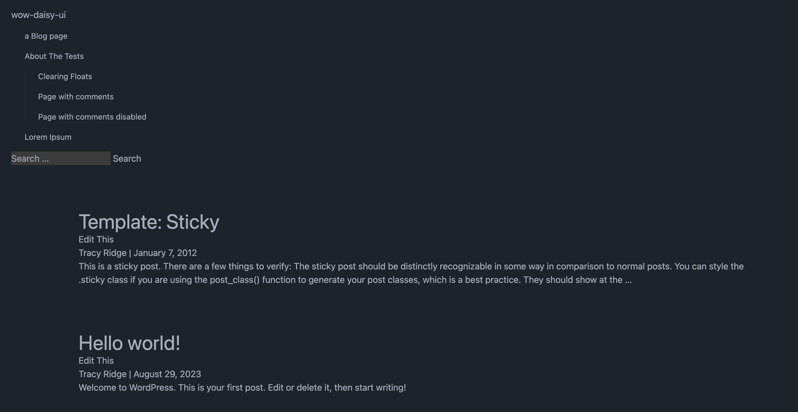
How it looked before the changes to the navigation.Navigation
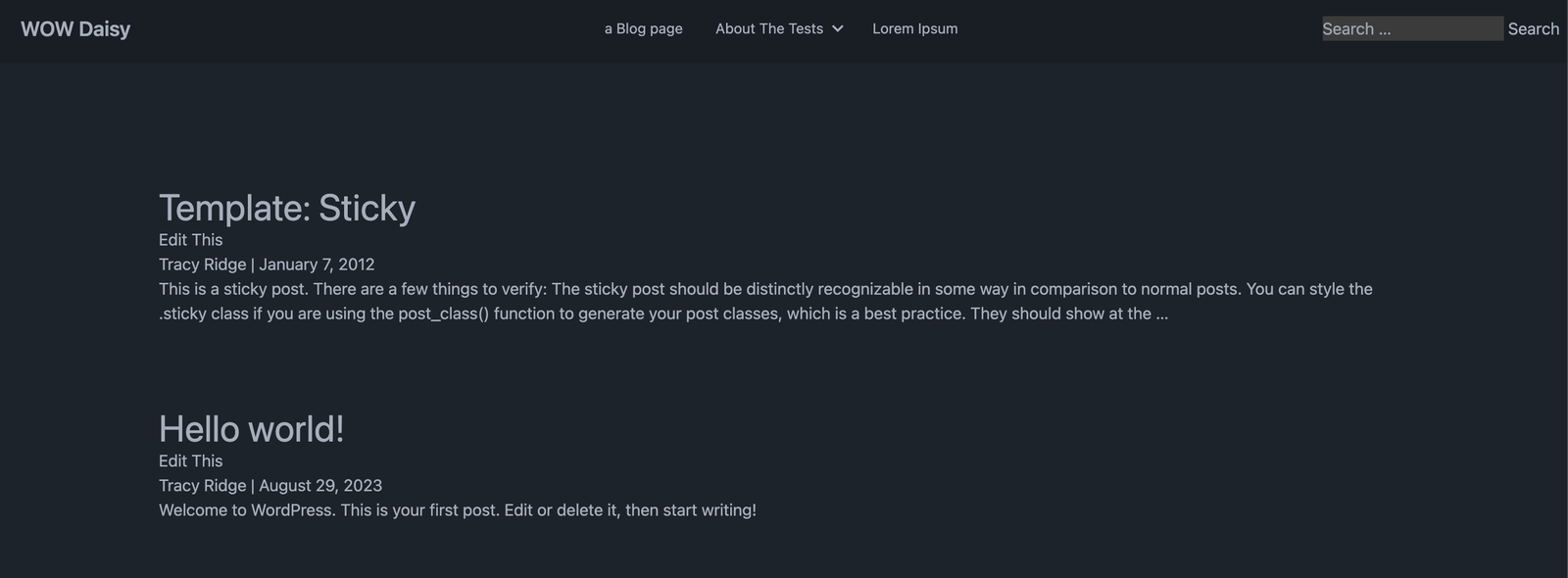
The navigation is the trickiest part of this setup. I have changed the menu to a shorter one in the WordPress dashboard. In Appearance -> Menus choose the short menu in the menu section. I have chosen a 3-part navigation with the logo on the left, nav items, including a dropdown in the middle and a search feature at the end. Something similar to this.
To implement this open header.php and add the following:
 1<?php get_template_part('inc/class-daisyui-navwalker');?>
 2
 3 <header id="header" role="banner">
 4     <div class="navbar bg-base-200">
 5         <div class="navbar-start" id="site-title" itemprop="publisher" itemscope itemtype="https://schema.org/Organization">
 6             <?php
 7                         if ( is_front_page() || is_home() || is_front_page() && is_home() ) { echo '<h1>'; }
 8                         echo '<a href="' . esc_url( home_url( '/' ) ) . '" title="' . esc_attr( get_bloginfo( 'name' ) ) . '" rel="home" itemprop="url"><span class="btn btn-ghost text-xl" itemprop="name">' . esc_html( get_bloginfo( 'name' ) ) . '</span></a>';
 9                         if ( is_front_page() || is_home() || is_front_page() && is_home() ) { echo '</h1>'; }
10                         ?>
11                     </div>
12                     <nav class="navbar-center" id="menu" role="navigation" itemscope itemtype="https://schema.org/SiteNavigationElement">
13                         <?php
14                  wp_nav_menu( array('menu_id' => 'navbar-menu',
15                  'container'=>false,
16                  'theme_location' => 'main-menu',
17                  'link_before' => '<span itemprop="name">',
18                  'link_after' => '</span>',
19                  'items_wrap' => '<ul id="%1$s" class="menu menu-horizontal px-1">%3$s</ul>',
20                  'walker' => new Daisyui_NavWalker() ) ); ?>
21             </nav>
22             <div class="navbar-end" id="search"><?php get_search_form(); ?></div>
23         </div>
24     </header>
To incorporate the Daisy sub-navigation, we have to customise a NavWalker class that walks through each element to build the navigation. In the custom NavWalker class, we search for the menu-item-has-children CSS class and add our custom code. It’s a little bit hacky but it does the job. If you have any suggestions or alternative ways of doing it get in touch. Take a look at class-daisy-navwalker.php on GitHub.

The navigation after the changes
Todo
As you can see many more features need to be added in future parts.
Theme – Default Daisy UI theme Automatic light/dark mode Footer Navigation ~ Search – Not Implemented ~ ~ Mobile friendly ~ ~ Sidebar ~ ~ Next/Previous Post ~ ~ Homepage ~ ~ Post Meta ~ ~ Comments ~
Conclusion – Daisy UI WordPress Theme Part 2
This concludes part 2 of building an awesome Daisy UI WordPress theme. There are many more changes to be made in the upcoming parts including making our design mobile friendly. Stay tuned! Please feel free to get in touch If you have any questions.
